

Coax
November 13, 2026 • Luka Grafera
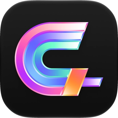
As fans of Coax, the app that turns your home media server into a linear cable channel guide, we were very excited to be offered the opportunity to create the icon and logo for it.

Default
Dark

Clear
We aimed to create a wordmark and symbol that were synonymous, which would allow either to represent Coax without both being shown simultaneously. The direction for both marks were heavily informed by the geometry of 90s broadcast logos, and their often showy color and styling. As we drew, we imagined it animating on a fuzzy CRT TV, with a sound mark chime.
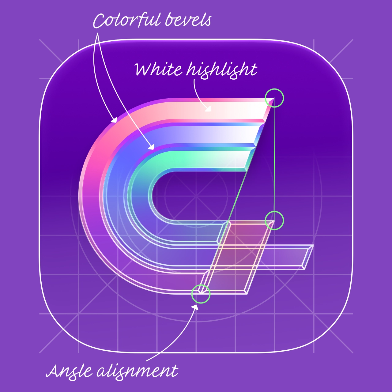
Each of the four letters of the wordmark is set in its own vibrant color, with neighboring colors reflected throughout the bevels to bring cohesion.
These same colors and angles are used together to form the coaxial cable initialism of the app icon. The angle of the C’s terminal follows directly through to the other, while the gold-colored cable trim aligns vertically with the tip of the terminal above it.
Though we think of app icons as having very saturated colors, they fit the best within the current system if they have a fair amount of white highlight. We gave the top-right terminal of the shape a strong glare for this reason.
Icons by Parakeet
We love to make app icons that developers and their users will love. So whether you need a brand-new app icon or a modern update to your existing one, let’s make it happen.
Work with Us