

App Icons for ATP
July 7, 2026 • Louie Mantia
Last week, Luka and I worked with the hosts of Accidental Tech Podcast—Marco Arment, Casey Liss, and John Siracusa—to design new Liquid Glass icons for their apps. Each submitted their own brief, and we created icons to meet their expectations and look exemplary on macOS 27 and iOS 27.
Listen to ATP #699 for a very in-depth discussion about these icons.
SwitchGlass
Default
Dark

Clear
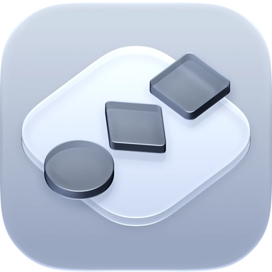
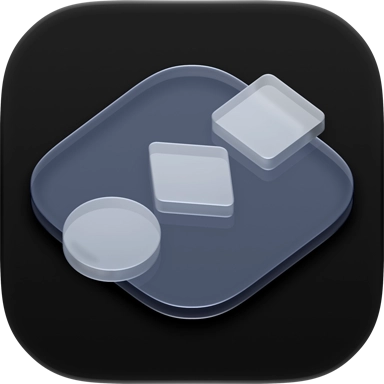
John already had a beautiful icon for SwitchGlass, made by our friend, Brad Ellis. We love this icon, and of all icons, this one made the most sense to adapt to Liquid Glass.
One of the challenges with this icon was reconciling with the fact that the background cannot be translucent glass in the “Default” appearance, meaning it can no longer show the user’s background through it as it once did. The “Clear” app icon style is exclusively available as a system-wide setting.
Because all app icon sizes are automatically rendered at a system level, rather than manually by designers like us, this required us to ensure high-contrast legibility at all sizes simultaneously. For this reason, the base tile shape is significantly more opaque than Brad’s original, with the metal shapes on top changing to a glass material, with translucency and refraction.
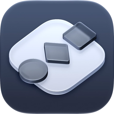
The “Dark” appearance flips this contrast to match the brightness level of other icons in that mode. An alternate icon was created with a darker background that matches the tint of the shapes atop the base tile, with the hope that one day macOS provides support for alternate icons just as iOS currently does. Until then, maybe it only lives in the app’s About window.
Alternate
Dark
Clear
Front and Center
Default
Dark

Clear
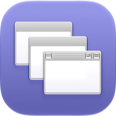
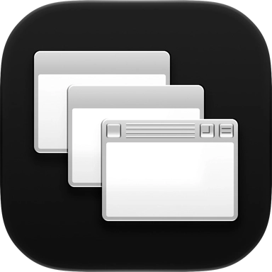
John has a very relatable love for the style of classic Mac OS. For his app Front and Center, he had previously recreated windows from Mac OS 9 as its app icon, so it was really important to keep some sense of that while merging it with modern Liquid Glass styling.
Here, you can see a middle-ground formed between the two, with small rounded corners, crisp edges around the window elements, and a familiar muted purple background.
As too much translucency can impact the legibility at smaller sizes, a subtle effect is used for these windows to pick up a little purple from the background. Apple gently suggests an 8×8 grid as a basis for app icon construction, so these windows are staggered at that amount, matching the size and weight of icons on the system.
Callsheet
Default
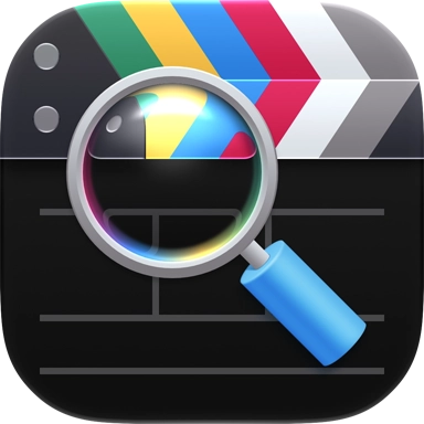
Dark

Clear
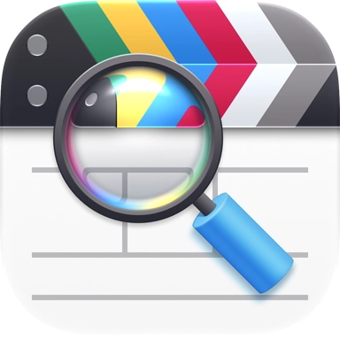
For Callsheet, Casey gave us complete creative freedom. However, this icon has a great story and is properly iconic. What Luka and I saw were opportunities to punch up what it already is.
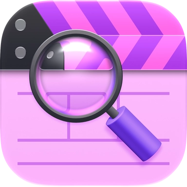
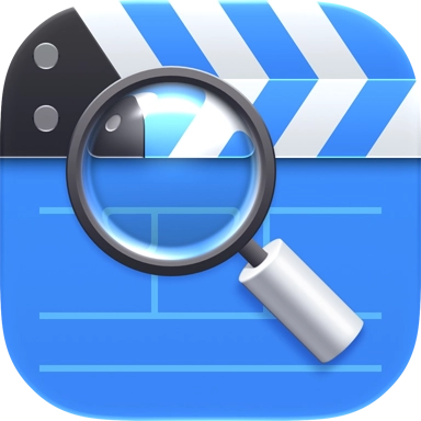
To that end, the clapper at the top was made taller, the hinge now matches the angle of the stripes, the magnifying glass uses native Liquid Glass refraction coupled with manual color refraction, and the bottom of the clapperboard has been simplified to a clean slate.
Of all the icons we made in this post, Callsheet is the only one with raster image layers: the magnifying glass handle and its shadow.
Every other element in these icons was rendered using SVG layers and Liquid Glass effects, but this handle needed more dimension than was easily achieved with the capabilities of SVG or the gradient limitations in Icon Composer. It’s perhaps not impossible, but we could get much more quickly and exactly what we wanted with an image. The shadow is also an image because Apple’s shadow effect currently assumes all shadowed elements are made of translucent glass, with more opaque edges than the body. To ensure this looked correct for our very opaque handle, we used an image.
Because Callsheet has many fun alternate app icons, we revisited them all, and even added a couple more.
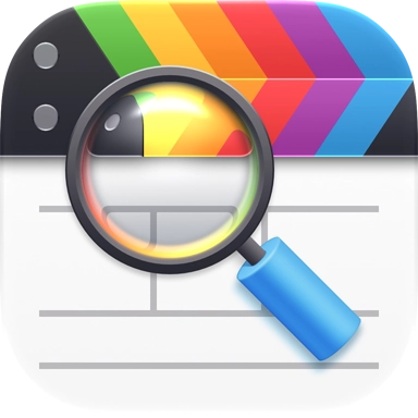
Fruit Co.

Classic
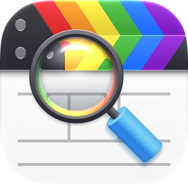
Pride
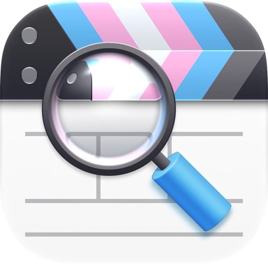
Trans
Pink
TestFlight
Overcast
Default
Dark

Clear
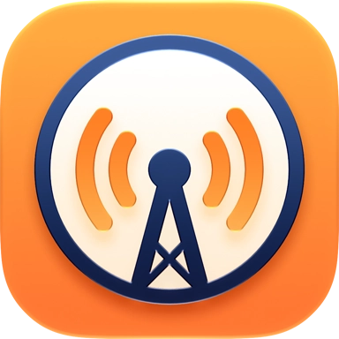
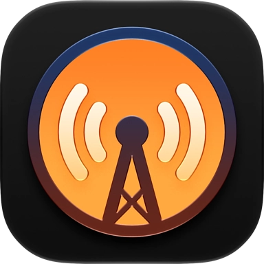
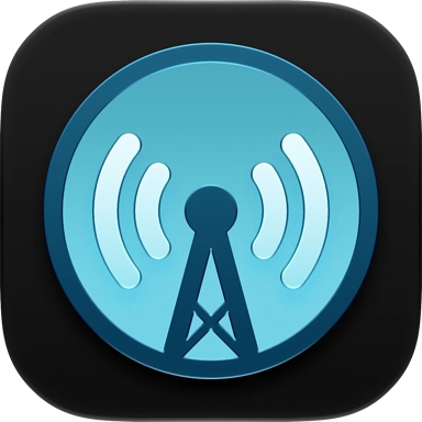
In 2013, I created the original Overcast icon with Brad Ellis at our former studio. The goal was to make an exemplary iOS 7 app icon, following Apple’s gridlines to match system apps. A few years later, we lightly updated it here at Parakeet with nicer shapes. And then again, last year, I made an adaptation for Liquid Glass on iOS 26.
But last week, we took a more comprehensive look. With crisper visual details now possible in iOS 27, we introduced translucency while maintaining a high contrast ratio and swapped dark grays for deep blues. While it has the same look at a glance, it’s a bit more handsome in our estimation.
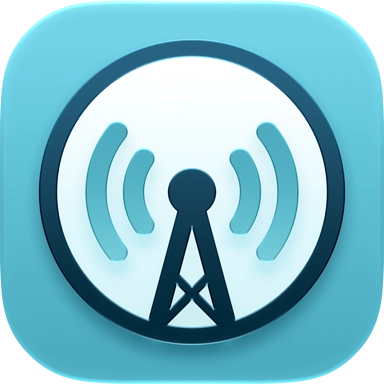
For members, we also cleaned up the teal variant.
Alternate
Dark
Clear
Unforgetful
Default
Dark

Clear
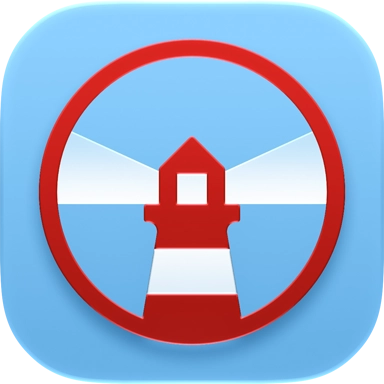
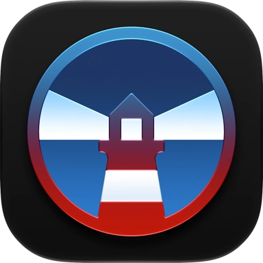
Marco is also developing a new reminders app. He came to us with a lot of ideas, and we also shared some of our own. Looking at the icons we’ve made with him in the past, like Overcast and Peace, we noticed a circular theme. Why not keep that going?
Metaphorically, we decided on a lighthouse, as its lights come around periodically to remind you that it’s there. This paired well with Marco’s desired red tint color, resulting in a red-and-white striped lighthouse, against a sky-blue background. The “Dark” variant, like Overcast’s, adopts a scenic appearance, with reds and blues that are synonymous with the app’s “Default” appearance.
Working with ATP
Each of these icons represent different ways of using Liquid Glass effects to match the system style, while retaining their own distinct identities that make them unique.
We sincerely want to thank Marco, Casey, and John for trusting us to create icons for apps that clearly mean a lot to each of them. All the hosts were great to work with. Even John. We swear!
Icons by Parakeet
We love to make app icons that developers and their users will love. So whether you need a brand-new app icon or a modern update to your existing one, let’s make it happen.
Work with Us