

The Shape of Apps
July 15, 2026 • Louie Mantia
While icons on iOS (formerly iPhoneOS) have always been rounded squares, and rounded-square icons have existed on Apple platforms for over 20 years now, Mac app icons have historically exhibited a variety of unique silhouettes, which helped identification alongside other visual tools like color, lighting, and dimensionality.
Because app icons from the Mac OS X era are so beloved, it’s very understandable—relatable even—how mandating rounded square app icons is downright heartbreaking to long-time Mac OS X users.
What happened? Why did this happen? And what should we do?
Breaking Boundaries
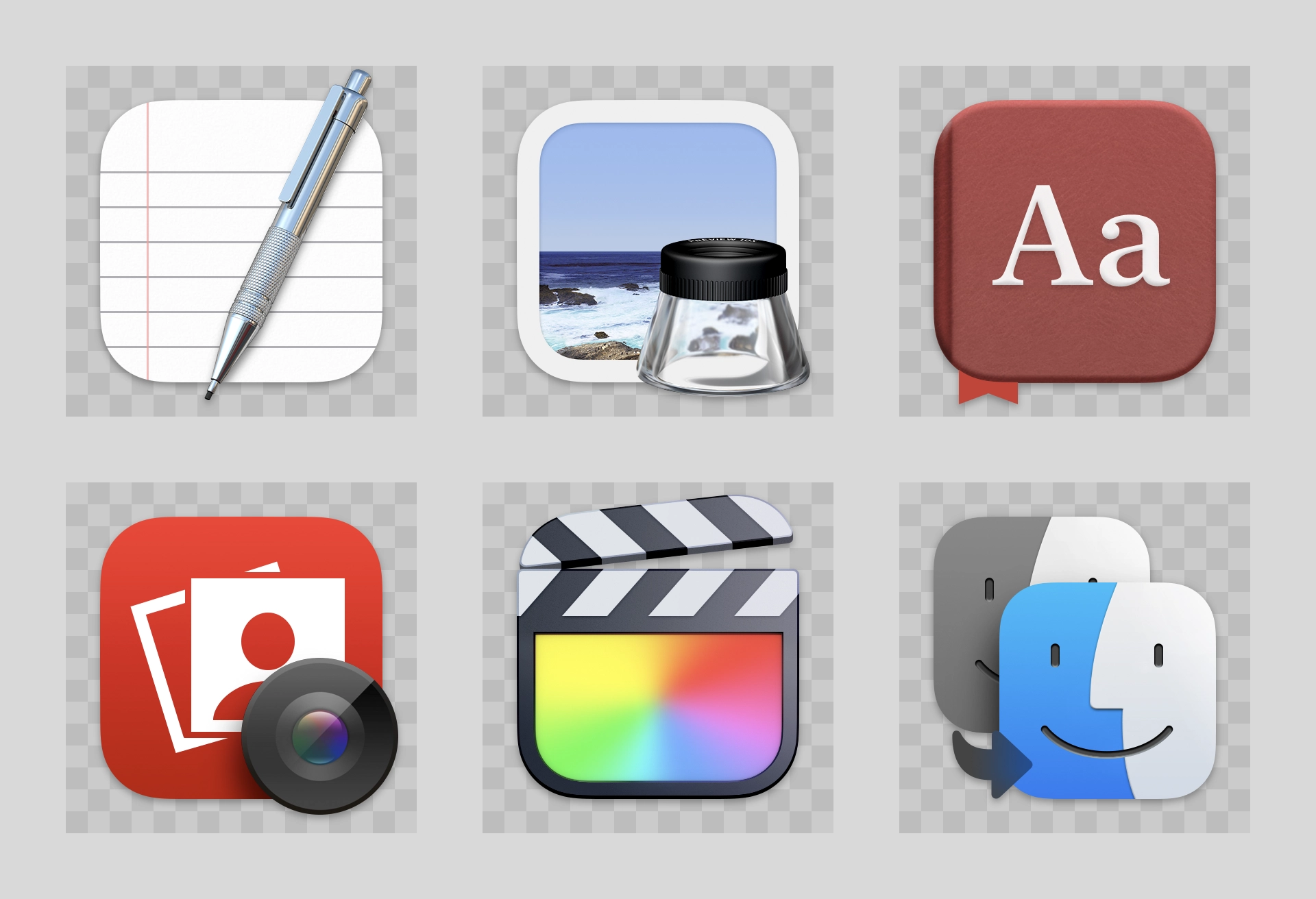
When introducing macOS Big Sur to developers, Apple specifically cited the rich history of Mac app icons. They encouraged rounded-square app icons to harmonize more closely with iOS, but without a hard restriction. In fact, some of Apple’s own icons on the platform outright broke the boundary of the squircle, sometimes with a tool that rested on top, like the pen in TextEdit, which was a fun mashup of iOS and macOS.
While developers have submitted full-bleed square images for iOS app icons since 2008, for these new squircle icons in macOS 11, Apple provided a template to compose app icons in an image editing tool like Photoshop, with full control over the canvas beyond the suggested—but not required—squircle. This template made it easy-ish for designers to compose macOS app icons that were identical to or synonymous with an iOS app icon, while leaving the door open to continue using arbitrarily-shaped app icons on macOS. Icons were saved as an asset catalog.
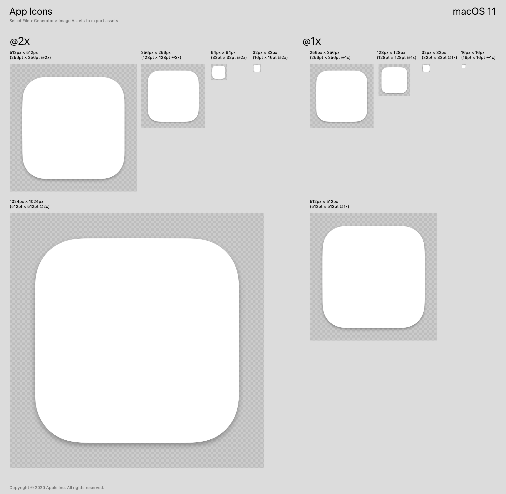
Spoiler alert: Not everyone used this template. I’m sure people at Apple thought by supplying this template, it would prevent guessing from developers, designers, and companies when figuring out the size and shape of their app icon on macOS.
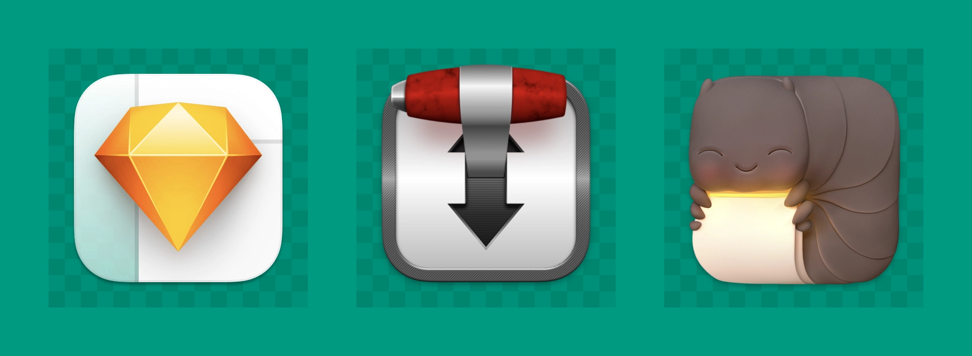
Thankfully, some designers and developers did use it. What’s more is that some took the opportunity to break the boundary—like Apple did—making app icons that would not be possible on iOS, but still cleverly using the squircle shape.
For example, the left side of this Sketch icon is slightly translucent, mimicking the sidebar appearance. Transmission’s gear-shift handle pokes out the top edge. Keka’s character silhouette approximates the squircle app icon shape organically.
And this was great. For a little while.
Squircle Jail
Only five years after macos Big Sur, macOS Tahoe introduced a new app icon style and format, which no longer allows app icons to have arbitrary silhouettes. And as you may already know, app icons that try to do so will go directly to “Squircle Jail.” Also, the squircle shape changed, so all of the pre-Tahoe squircle icons are just slightly off.
From my perspective, there are three versions of Squircle Jail:
- A square app icon that does not match the official shape and is therefore masked to the official squircle shape.
- A pre-Tahoe app icon that the system scales down and places on a neutral, light-gray squircle background.
- An app icon that is voluntarily scaled down and placed on a custom-colored squircle background.
The first of these—more often than not—is a good thing. Examples include third-party apps that have rounded-square icons, but look off. Too large, too small, or a mismatched corner radius. For these cases, the OS scales the square artwork, masks it to the standard squircle app icon shape, and fills in the corners with the same color if necessary. Liquid Glass effects are applied automatically if the foreground and background elements are identified. Nearly every instance of this has a great result.
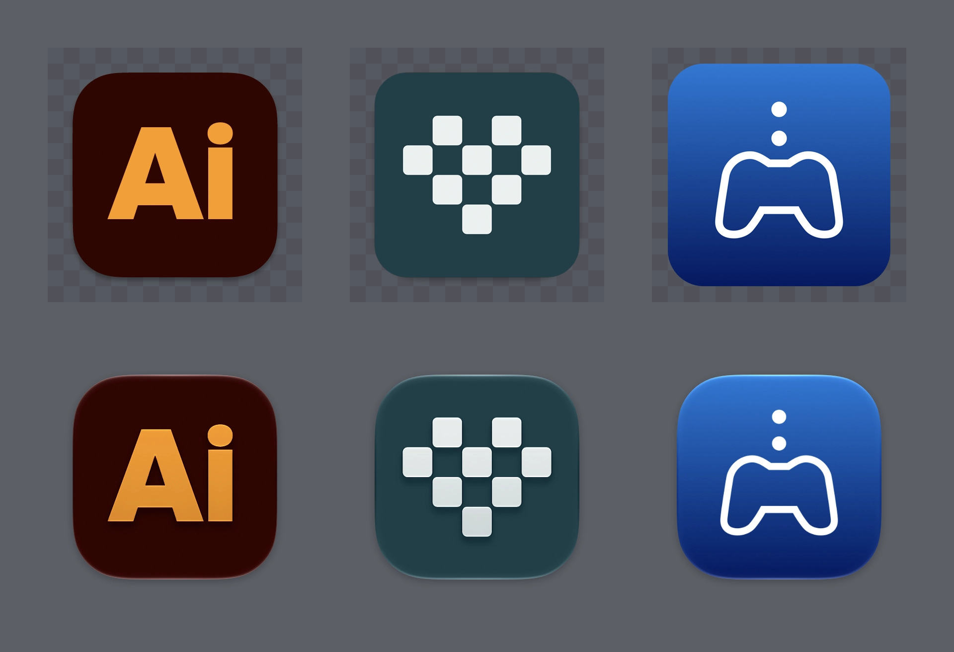
The second type of Squircle Jail is more controversial, because these app icons were specifically drawn with the intention of fitting in. Overriding that intention feels like punishment for having done the right thing. App icons in a style that was recently encouraged by the system are now scaled down and put inside the squircle as if it were a container. Every icon that was utilizing the previous squircle shape suddenly looks much worse than before.
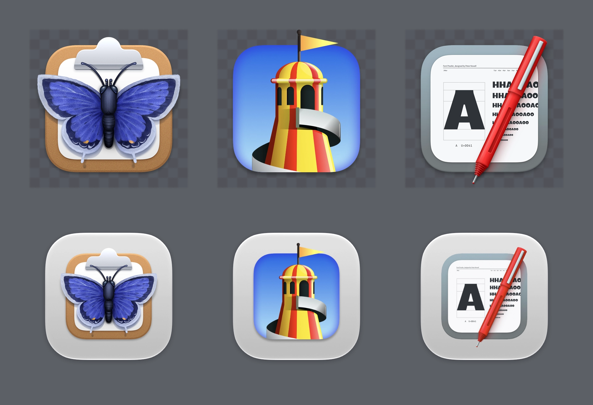
However, there are many arbitrarily-shaped app icons that were not made with the intention to fit in with recent macOS releases, and these too are scaled down and placed on light-gray squircles. For apps that demonstrate little-to-no familiarity with the system they run on, this doesn’t offend me.
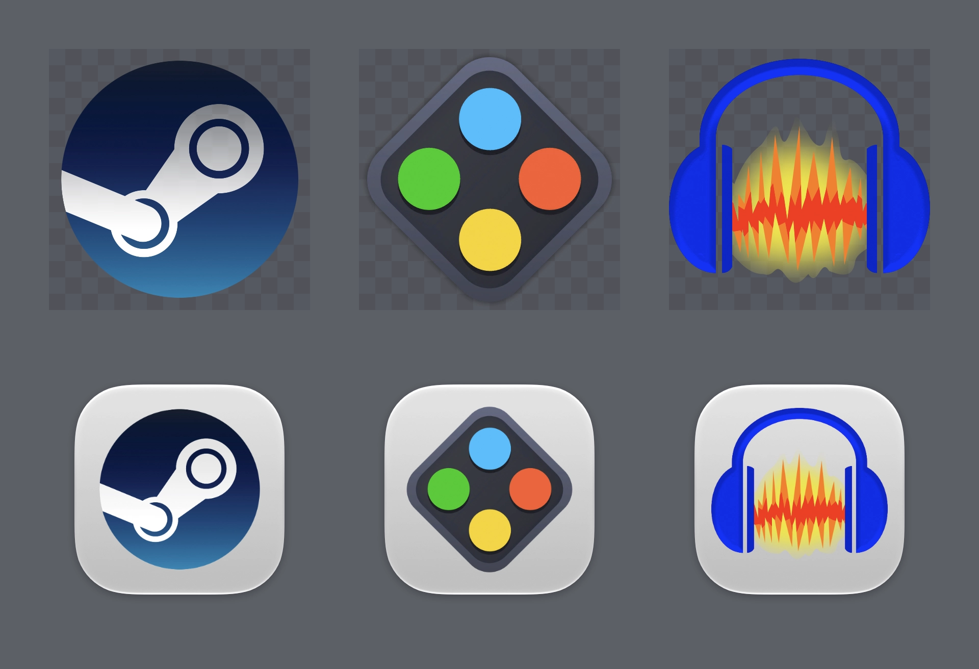
The third version of this concept began with Big Sur, exemplified by arbitrarily-shaped app icons which “turn themselves in” to Squircle Jail. Developers scale down their icon into custom-colored squircles, so they look more in line with the system, without abandoning the icon they might have used in the pre-squircle era.
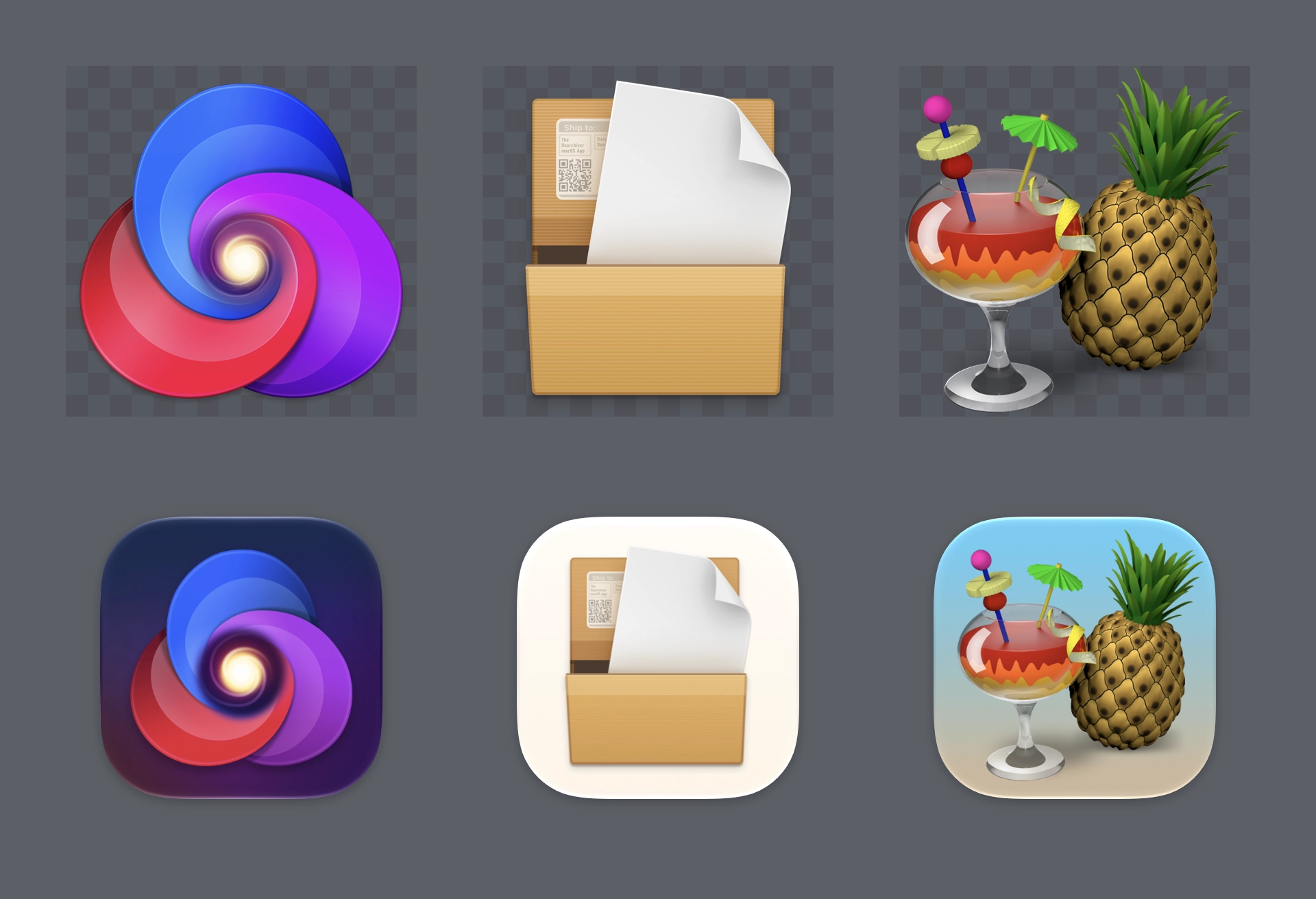
It’s worth noting that some of the platform’s best icons look worse, while some of the platform’s worst icons look better.
Designing at Scale
Before Mac OS X Leopard in 2007, icons were significantly smaller than they are today. That is, their resolution was a lot lower even though they were displayed at the same physical size. At that time, app icons maxed out at 128×128 pixels, and because the display resolution was also lower, you could see the gaps between pixels, which your brain filled in. This is not unlike how old video games on CRT televisions appeared to have more visual detail than when the same sprite assets are viewed on modern, high-resolution displays.
This maximum icon size increased to 512×512 pixels to support a new feature in Mac OS X Leopard: CoverFlow. Even though this number appears to be “4×” the previous resolution, it contains exactly 16× the amount of pixels that a 128×128-pixel icon has.
The resolution increased once again, for retina Mac displays in 2011, this time to 1024×1024 pixels. That’s 64× the amount of pixels that are in a 128×128-pixel icon, which was the maximum icon size just five years prior. A detail that was once easily fudged in a 2×2-pixel square now occupies 256 total pixels. You can’t fudge that detail anymore. At this scale, making app icons is a whole new ballgame.
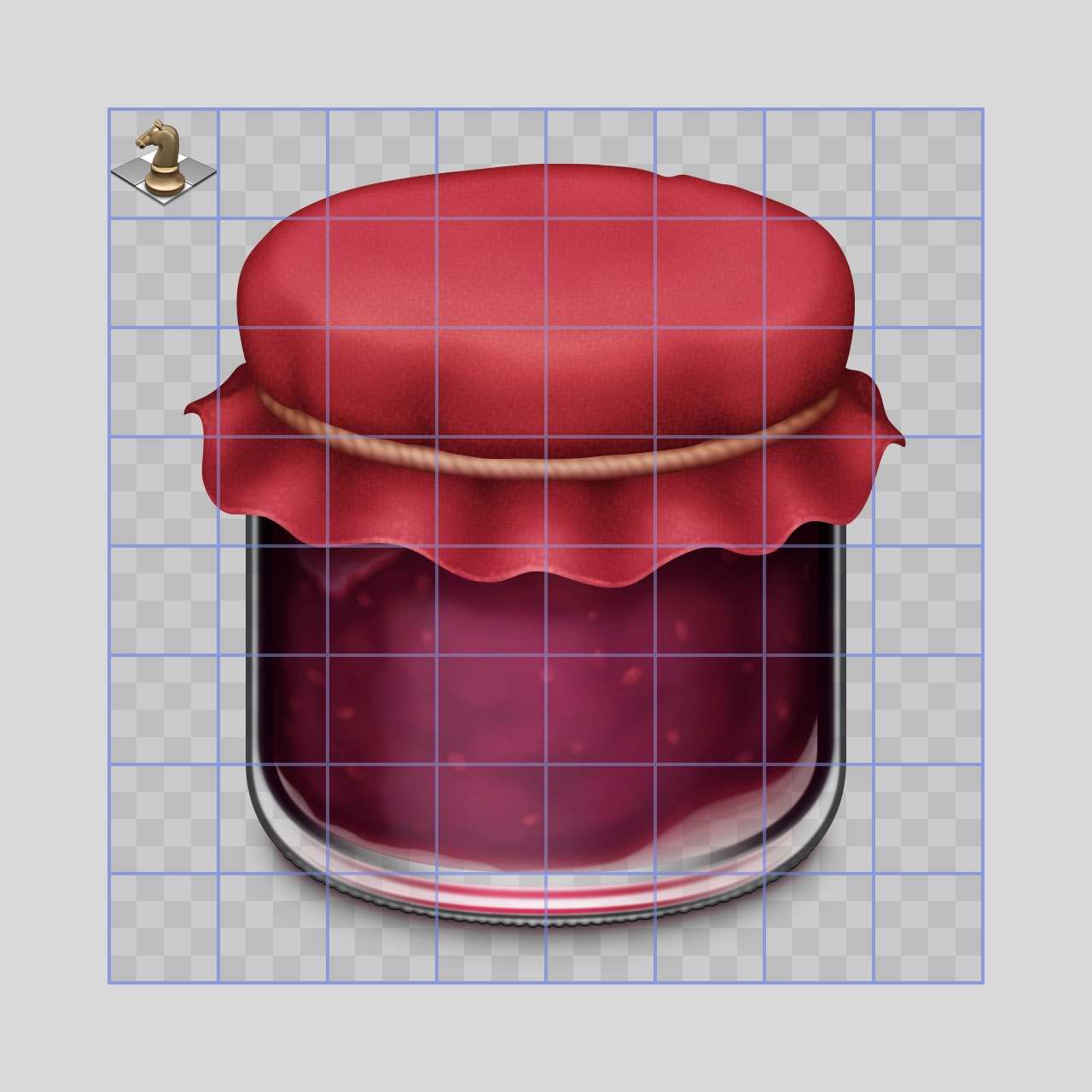
What people who are not icon designers may not know is that in addition to this increased maximum resolution, icon designers were expected to continue making all the previous resolutions, including hi-dpi versions of previous resolutions, packaged into an ICNS file.
This was a lot more work for icon designers than it ever was before.
Pre-iPhone, the Apple developer community was relatively small. Developers were generally familiar with Apple’s platform design. Mac apps that predated iPhone often had app icons designed specifically for Mac OS X, not just by professional designers, but by professional icon designers, of which there were few.
The iPhone SDK and App Store led to the developer community exploding in size. This revealed a noticeable problem: not everyone developing iPhone apps knew how to design in the style that users expected on Apple platforms. In fact, very few did.
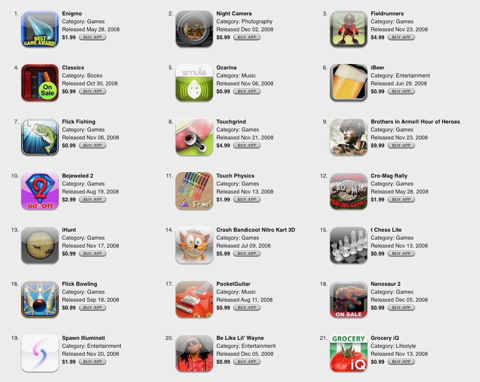
Every developer had their own opinions about what app icons were and how they were going to approach them. Some associated the task with marketing, and for a while “on sale” or "award" violators were seen on the App Store.
The task of making app icons became more complicated as the iPhone and iPad product line grew. Somehow, iOS and iPadOS app icons had more required icon assets than Mac app icons did. Icon designers could easily tackle this, but others would dread it. Good icon designers would touch-up or even completely redraw icons at smaller sizes, but no one else was really likely to do that.
And then when the corporate world saw iPhone as a huge, new opportunity, it introduced yet another problem.
Corporate Blanding
Lots of iOS and Mac apps come from companies that also distribute on other, non-Apple platforms. Every platform hopes that apps will adopt platform-specific conventions, but it’s a tough battle to win. Design and development teams—sometimes for business reasons—will design company-first, platform-second. Their app is not just for one platform; it’s for any and all platforms, including the web.
Instead of taking care to design and develop solutions specifically for Mac and iPhone, newer and bigger companies that don’t only make apps often ship apps with logo icons, rather than app icons. We’ve all seen it.
Years ago, I wrote about how icons are not logos. These are different things that serve different purposes. Logos are unique marks to recognize a company or product, but icons aim to inform people of a purpose. App icons are in the middle, balancing the brand with the purpose. Making something that does both of these things while also trying to fit in stylistically with the system is a lot to ask.
Big businesses often don’t even attempt to strike this balance, not because it’s difficult, but because this is very low in the hierarchy of things that are considered. Making a good app icon is not on their radar. People in charge of shipping this software don’t read the HIG. They don’t even know what that is. Out of ignorance, they just slap their logo on a squircle.

Nowadays, it’s these bland, big-business logo icons that make up a good chunk of iOS Home Screens and macOS Docks, instead of the beautiful, illustrative app icons that used to dominate our devices.
Knock, Knock
It’s flat design.
Creating UI and icons in Apple’s former visually-rich, high-resolution style requires discernment, skill, and knowledge of the system. With the reality of a growing industry of designers and developers who are not deeply familiar with making things to that standard, I can only assume Apple felt a need to change their app icon and UI style to something that could be more easily replicated.
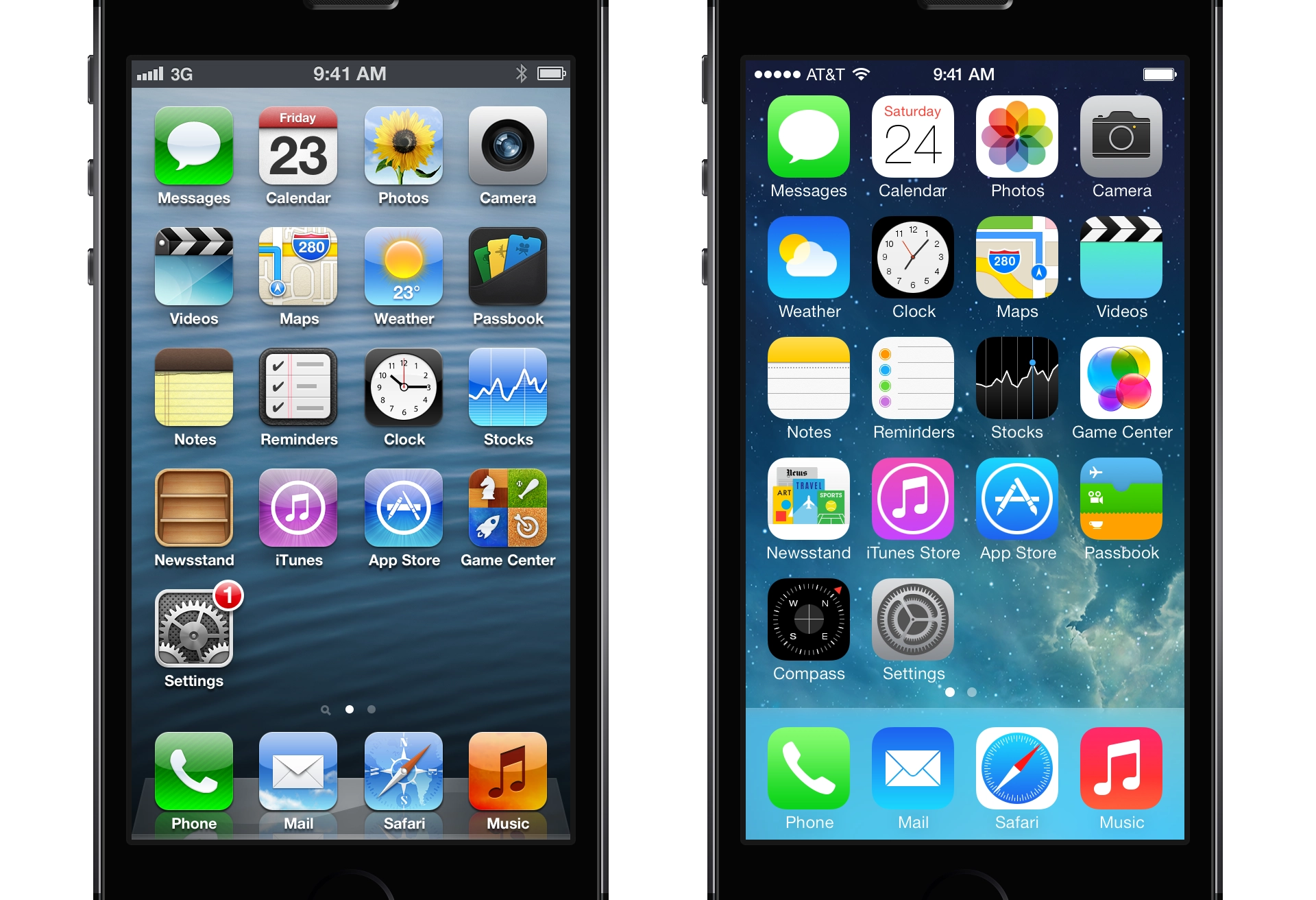
The “flat design” appearance of iOS 7 did not occur to be trendy, to stroke an executive’s ego, or even to make things better for users. This was for the benefit of newer third-party developers and big companies who were unable or unwilling to execute at the level required of Apple’s previous platform style.
Round 2
Liquid Glass is not so much a new style as it is a refinement of the iOS 7 style. The principles largely remained the same, including the decision to restrict app icons to the bounds of a squircle, this time including macOS. Because while some designers and developers really cared to make their app icons look great on macOS, including proper utilization of the squircle, Apple knew not everyone could, and not everyone wanted to.
The reality we all witnessed over the last almost-20 years is one where our macOS Dock had a few apps that were not developed by some indie developer who cared. The apps we didn’t want to use—but had to for one reason or another—looked very out of place.
At some point, you’ve probably downloaded a game on macOS with an icon that uses the entire 1024×1024 canvas, without rounded corners. Or maybe you need an app for your job, and it hasn’t been updated in ten years, with an oversized glossy circle. Or there’s a very useful niche utility with an absurdly complex silhouette.
It happens.
Masking all of these app icons to a squircle, and even applying Liquid Glass effects to them, aims to solve this problem. And this follows the same principle of iOS 7, which is to make it easier for all apps to fit in on the platform, especially apps built by designers and developers who aren’t familiar with how to make an icon that looks great next to first-party icons.
Just so I’m clear about my preference, I would love if Apple provided a way for designers to poke outside that squircle boundary. Some of my favorite app icons did that. But also some of my least-favorite app icons ignored this shape entirely, when it was used for every system icon in the last five years. Whenever those apps showed up in my Dock, it was like a stain on my shirt I couldn’t get out.
Despite the genuine loss associated with the squircle restriction, there’s more than one way to design with it.
Container vs. Canvas
I have been designing iPhone icons since before the App Store ever existed. So, I’ve been doing this very specific thing for longer than most. I’ve designed rounded-square icons for nearly 20 years. And one of the things I learned early on was that this shape is not just a container; it can also be a canvas.
The difference is this: if you treat the squircle shape as a container, you can only put an icon inside of it, but if you treat this shape as a canvas, then the icon is the squircle.
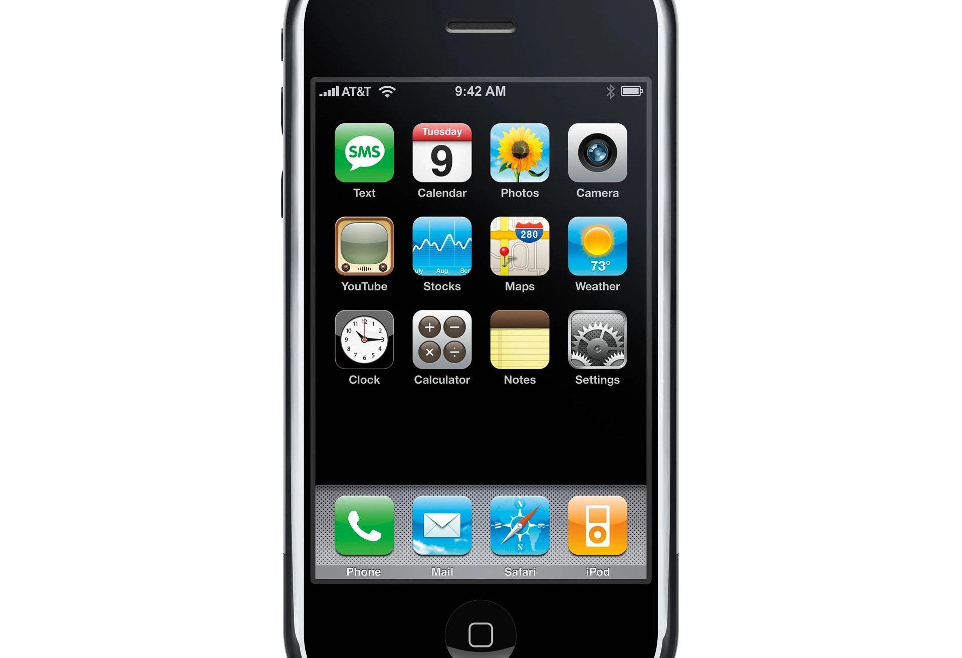
The original iPhone from 2007 used this approach for most of its icons, but especially notable is the YouTube app icon, a vintage TV that filled the rounded square with an entire object.
If you frequented designer spaces in the early years of iPhone, you probably remember seeing early examples of this: flat objects that went edge-to-edge and dimensional objects in forced-perspective to fill the entire shape.
An icon that is designed edge-to-edge doesn’t get itself thrown into Squircle Jail, because the entire concept of Squircle Jail relies on an arbitrarily-shaped icon being contained within a squircle, rather than the squircle being the icon, serving as its form.
Form Communicates Function
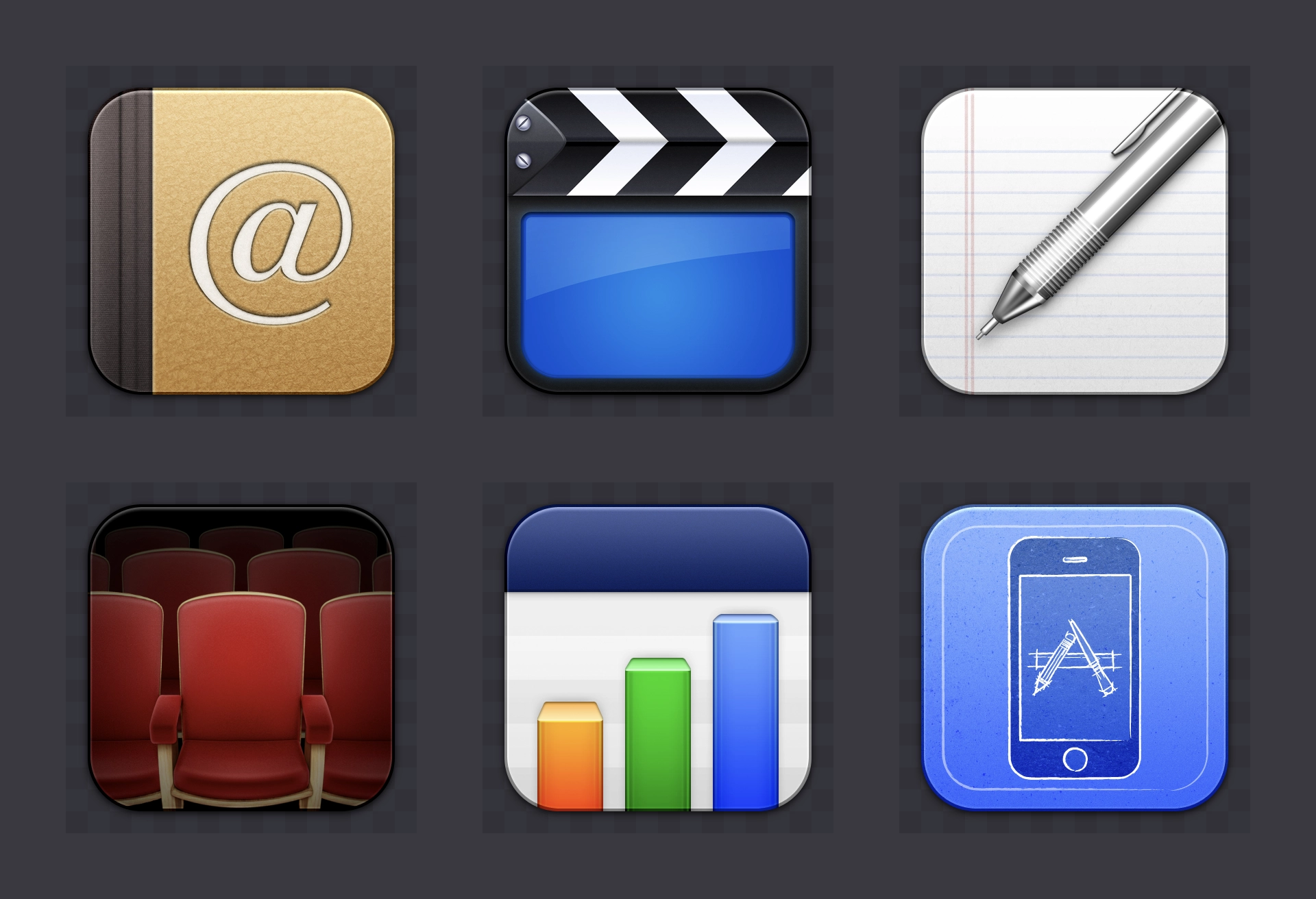
In 2009, I was interviewed on MacStories, sharing my motivation to create Flurry, a downloadable rounded-square icon set for Mac OS X made with my friend David Lanham at The Iconfactory.
Quoting myself:
I started to realize that I didn’t want to put certain apps in my dock based solely on their shape or color. […] I took what was learned with iPhone and Dashboard, then David and I decided to make an icon set based around this principle: uniformity. If all icons had a certain constraint, such as rounded squares, even icons with drastically different colors or objects inside could look perfectly fine next to each other.
Seventeen years later, now that app icons on macOS do have a uniform rounded-square appearance, they do look better adjacent to each other in the Dock. What’s even better is that over the last 19 years, apps on Apple platforms have distinguished themselves with a very recognizable visual identity.
The shape of apps is a squircle. And it has been proven to work for everyone. Companies can use their logo as an app icon. Designers can create something specifically for the platform. And both of these get to look like an app. Whether people consider the squircle a container or a canvas, this uniform appearance communicates its function: a squircle represents an app, just like how a piece of paper represents a digital document, or a folder represents, well, a folder.
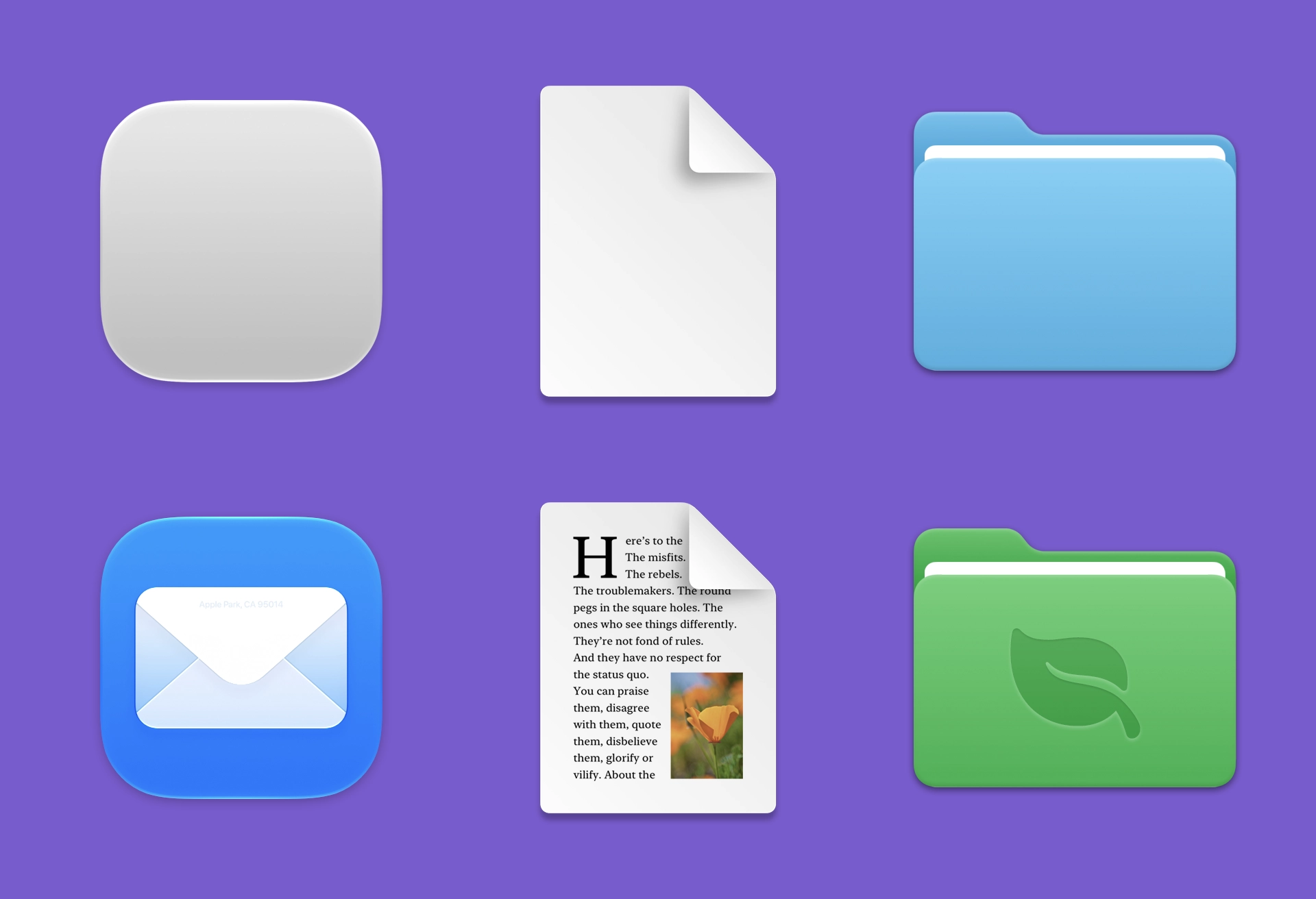
Semantically, there’s something really beautiful about that. As an icon designer, I appreciate that different types of things have visual distinction.
This is not dissimilar to how media types in the physical world have recognizable standardized shapes that represent one type of media, like VHS, DVD, and Blu-Ray boxes. Artwork wraps to fit those shapes. Artwork for vinyl records, cassette tapes, and CD cases do the same. You fill the canvas. And the canvas for apps is a squircle.
Co-Branding
A great app icon combines its own identity with the identity of the platform. If that weren’t true, we would’ve heard advocates for Windows XP-style icons on OS X and vice versa. Making a platform-specific app icon was the goal decades ago, and it remains the goal today. For app icons of yore, that meant adhering to the platform’s style in terms of perspective, lighting, and render quality. This time, it means making something with the form of a squircle.
The app icon canvas was once a square, then it became a square with a recommended squircle inside it, and now it’s just a squircle. The space around the squircle is not part of the icon’s canvas.
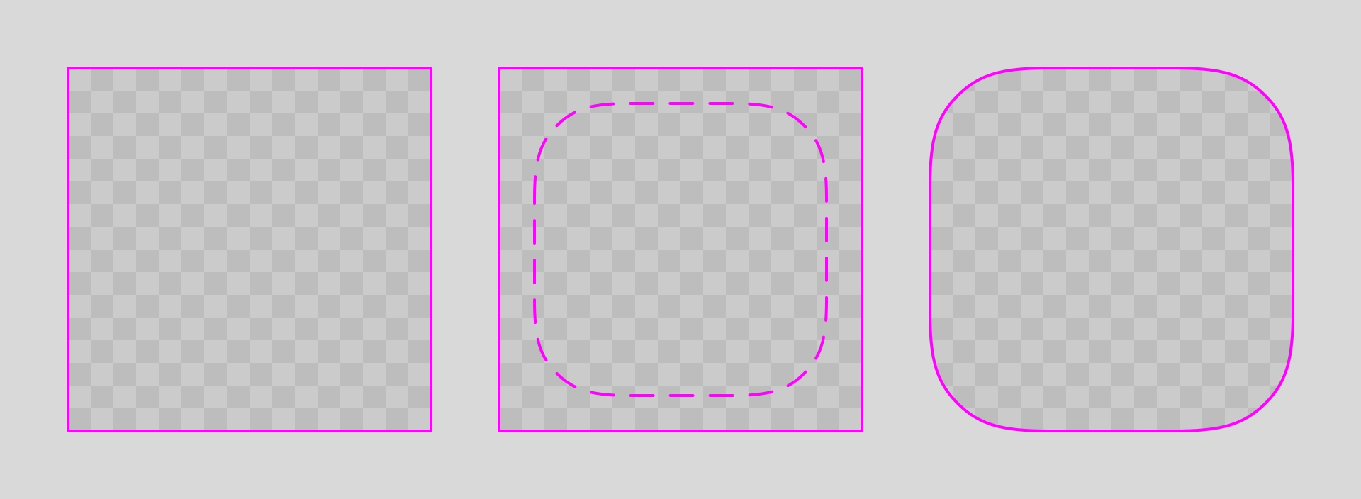
The objective here is not just to make an icon—it’s to make an icon that looks like it belongs on this platform. Therefore, it’s useful to think about each app icon as a co-branding opportunity.
App icons for Apple platforms should be Squircle × Your App.
The Tradeoff We Make
There were fun and beautiful third-party app icons that harmonized with the original style of Mac OS X. And there were new ones that did the same with macOS 11. The tradeoff we make now is that while we lose the ability to have arbitrarily-shaped app icons, we gain a higher percentage of app icons that harmonize with the system. More than ever before.
The new format for app icons can be a limitation or an opportunity. It is absolutely a tradeoff. And it can be argued whether the tradeoff is worth it. But for over a year now, I have not seen a single app icon that looks too big or too small compared to system icons. I have not seen a single app icon that has a different corner radius. Even icons that don’t use Liquid Glass styling look like they belong in the Dock.
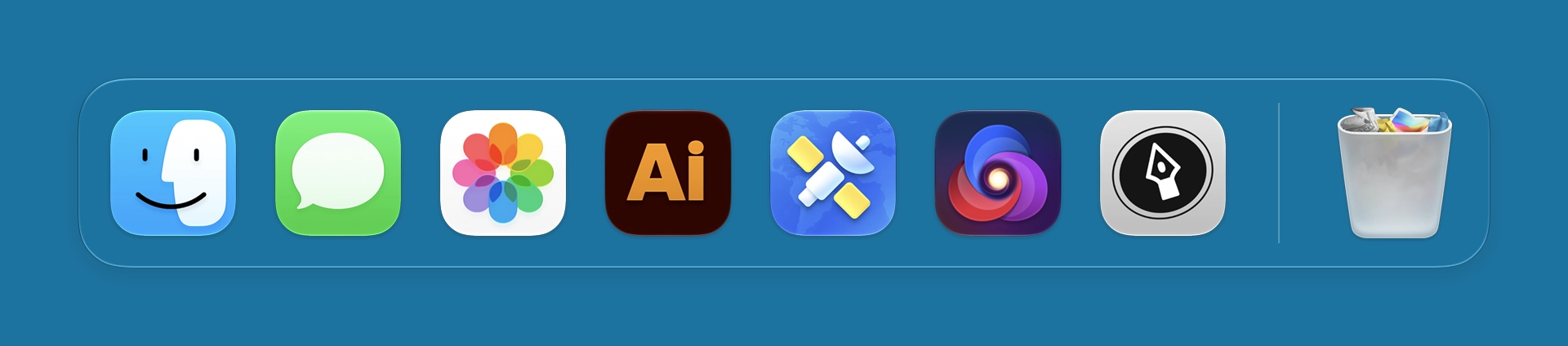
There will be new, beautiful app icons in macOS 27, too. I know it. Because people who care about making nice things for this platform just keep doing it.
Icons by Parakeet
We love to make app icons that look great on macOS, so if yours is currently serving time in Squircle Jail, let us bail you out.
Work with Us